CNN’s original programming had strong individual show identities, but plain imagery was not enough to help viewers decide what to watch. A composition that worked on one screen could become difficult to read when resized or cropped for another.
Titles, episode information, and focal imagery needed to remain clear on a phone, on the web, and across the room on a TV. The challenge was to preserve each CNN Original Series’ identity while making its key art work for the way viewers browse.
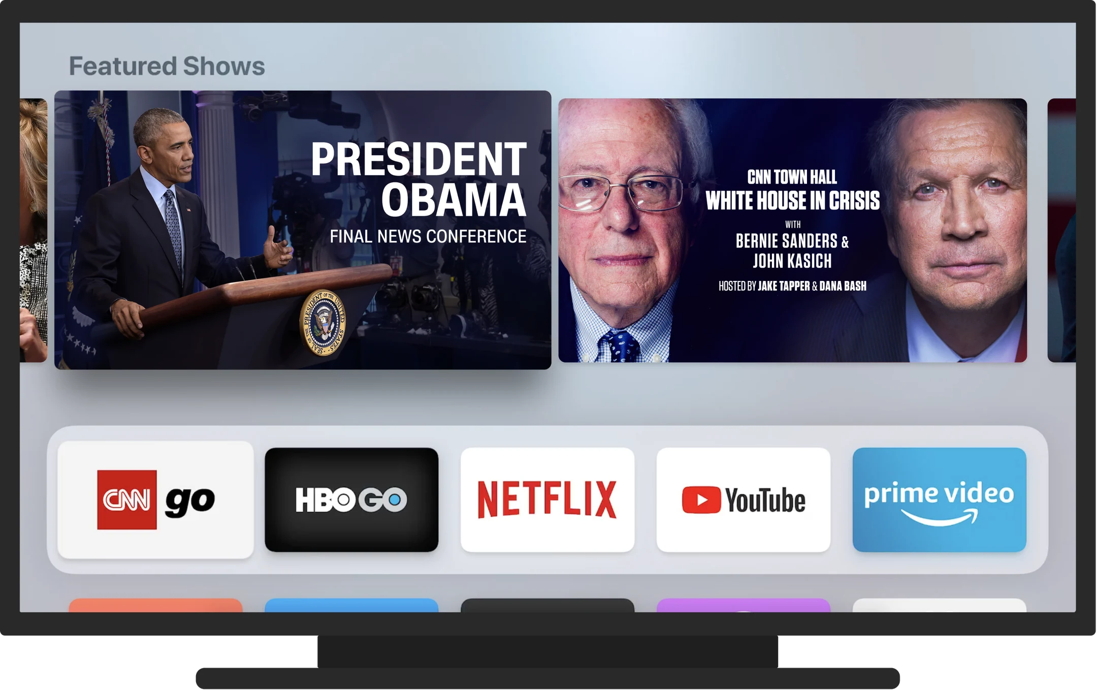
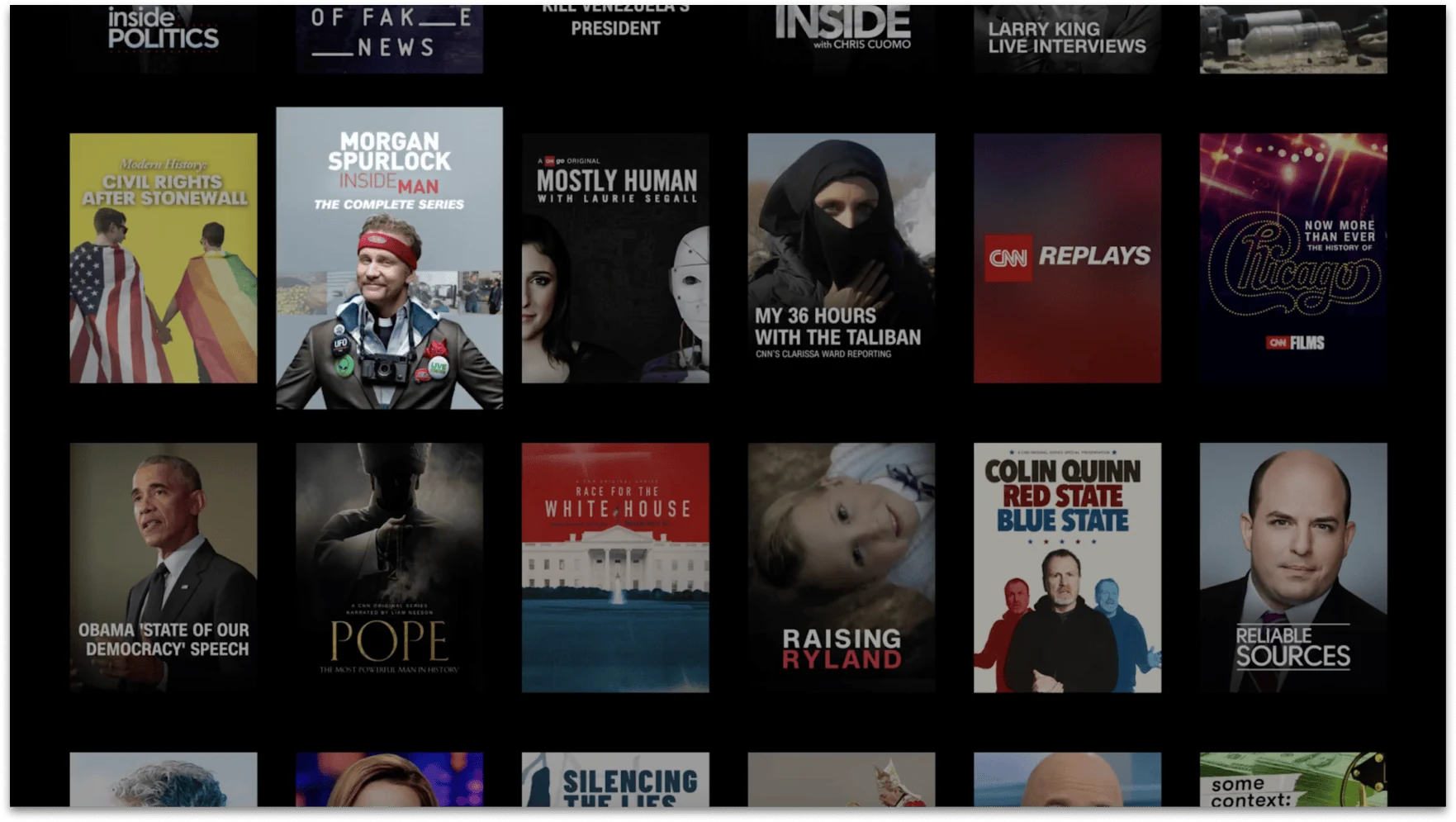
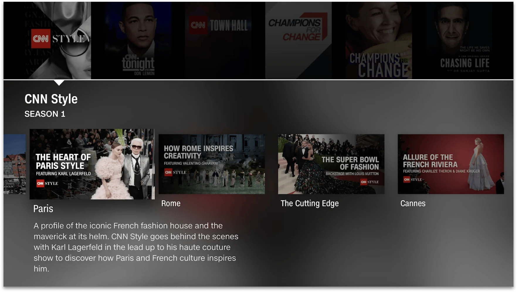
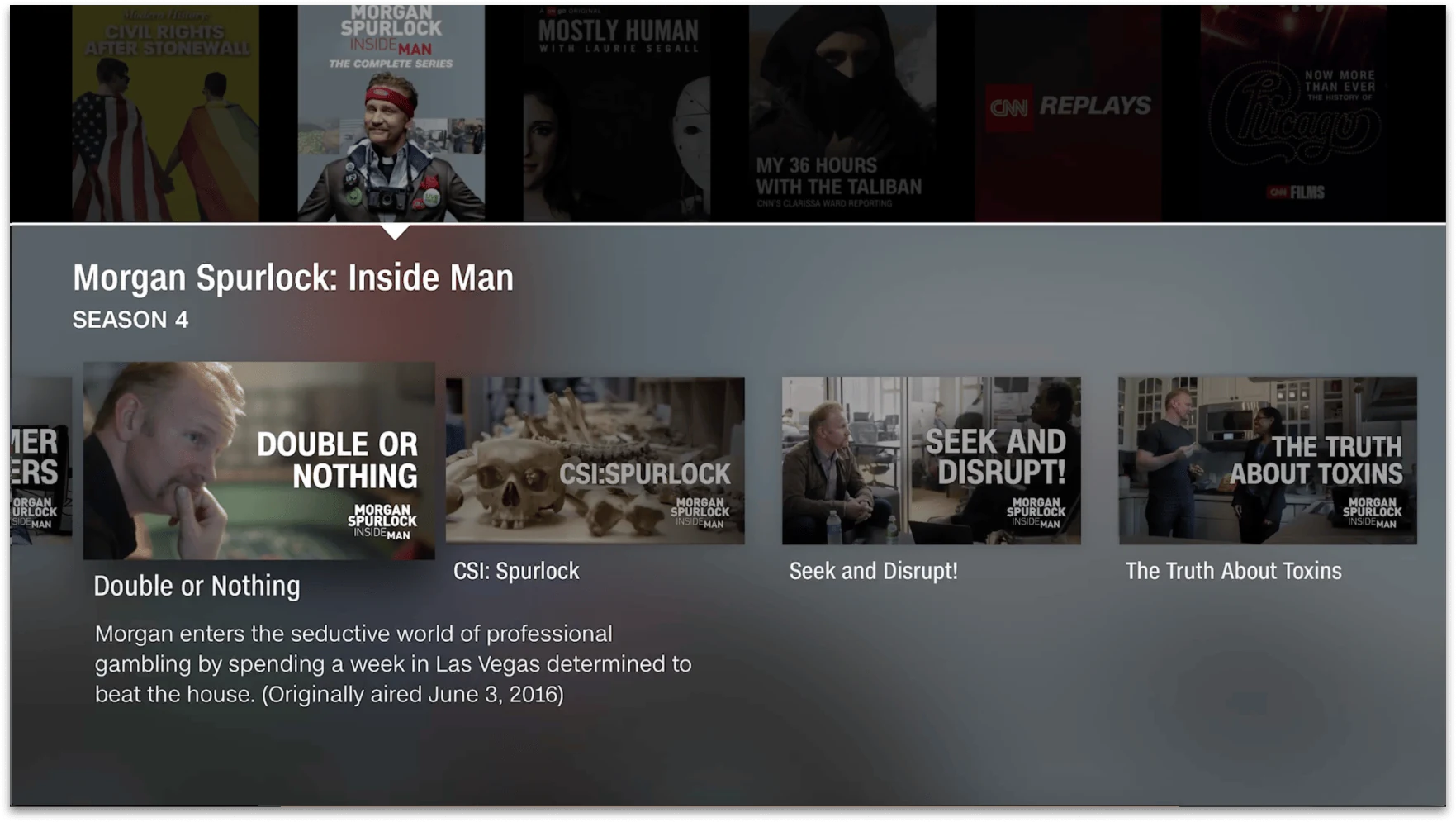
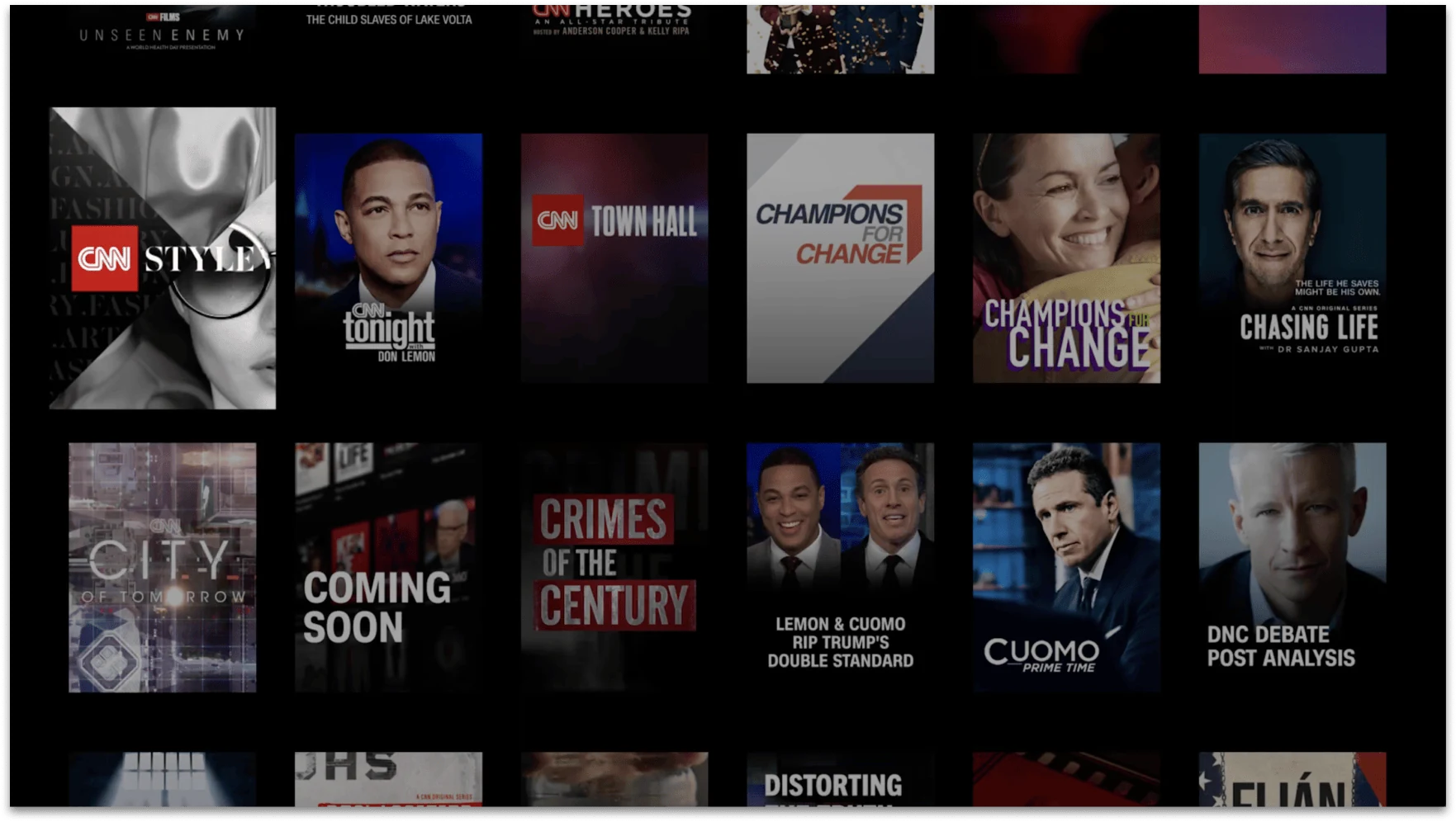
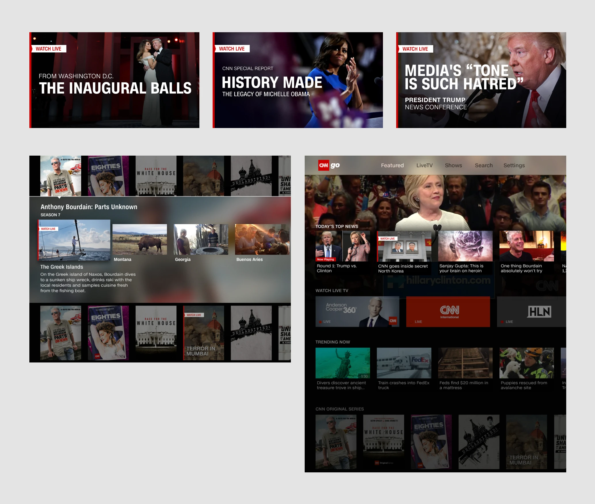
CNNgo's top shelf content on Apple TV
The approach
Compose for the screen.
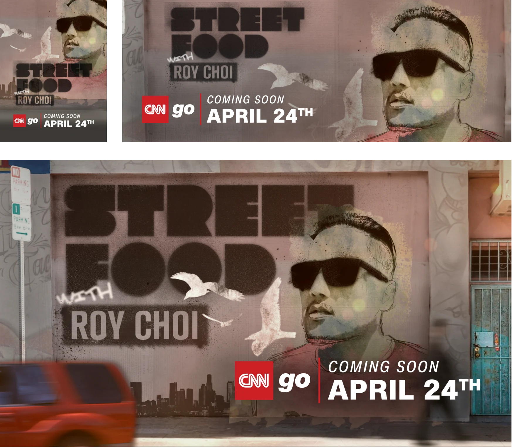
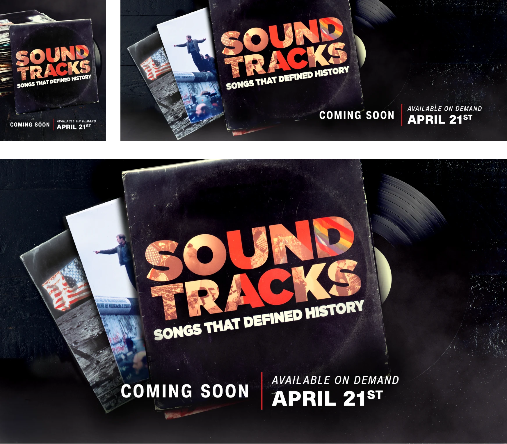
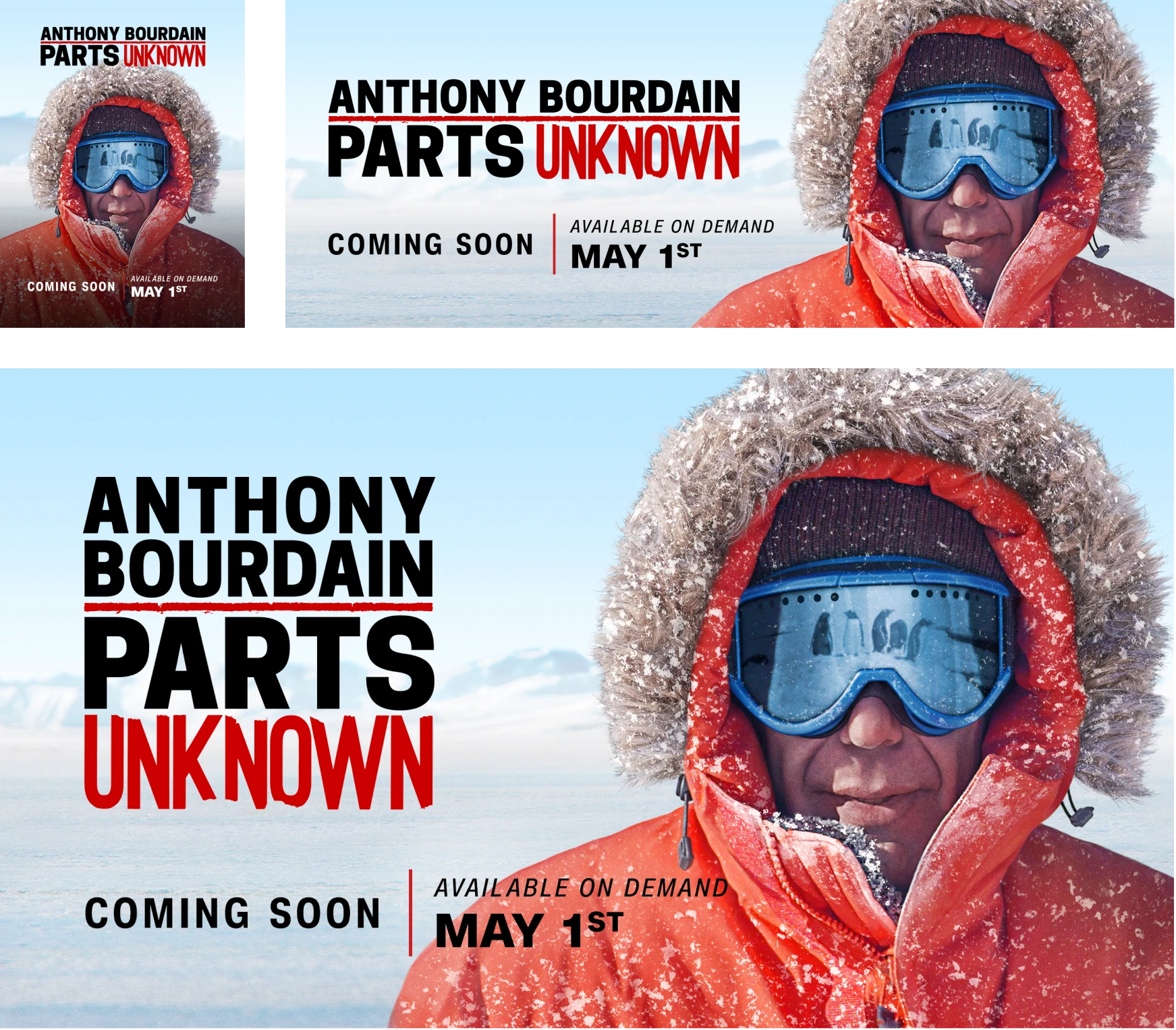
I treated each breakpoint as its own composition. Across three purpose-built aspect ratios, I adjusted image crops, title placement, episode information, scale, and visual hierarchy for mobile, web, and connected TV.
Consistent title and episode treatments gave viewers recognizable patterns to scan, while each series retained its own visual identity.
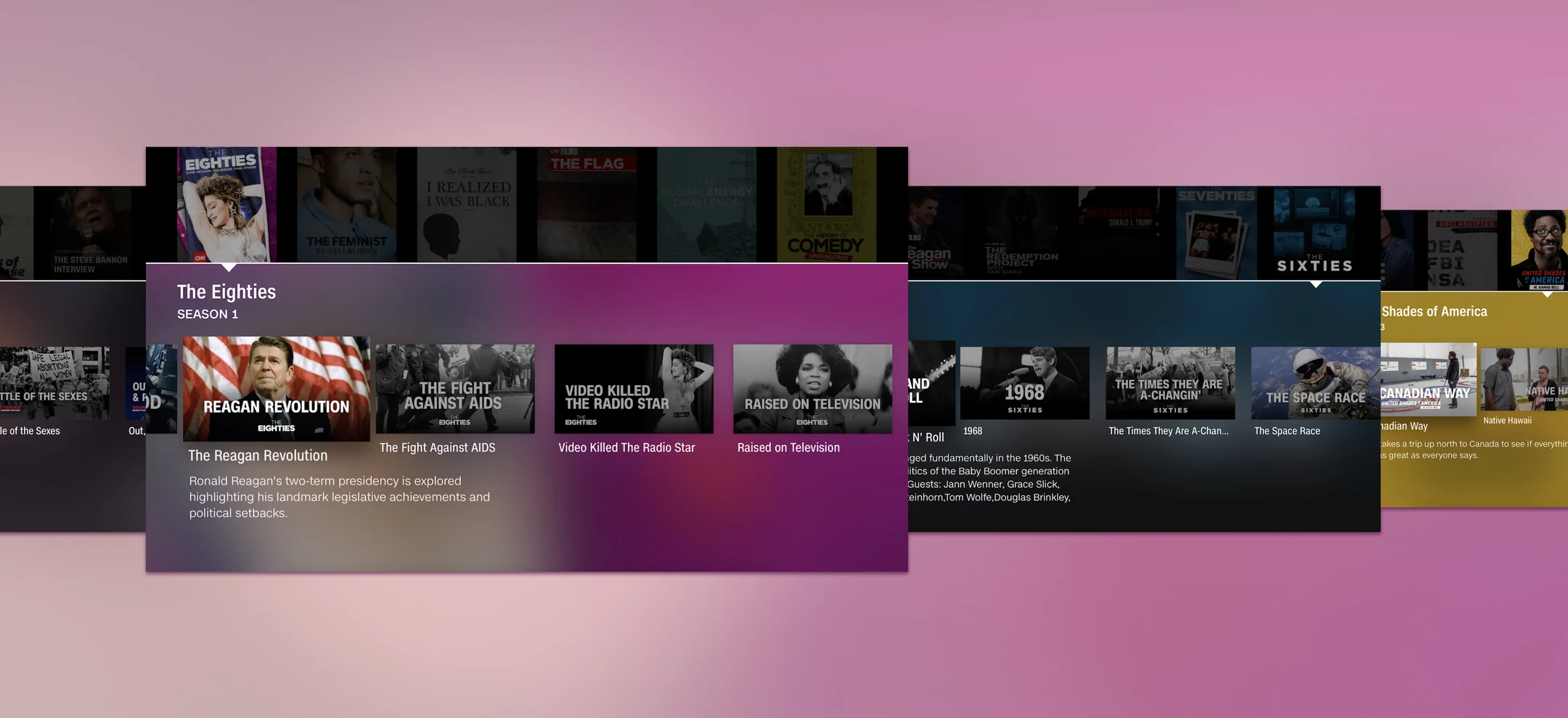
Tile artwork in the connected TV experience.
The system
One library. Three purposeful formats.
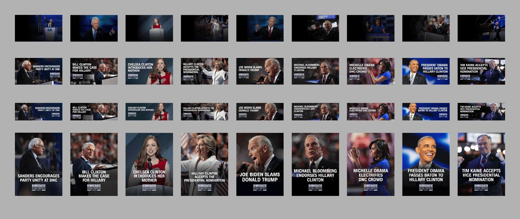
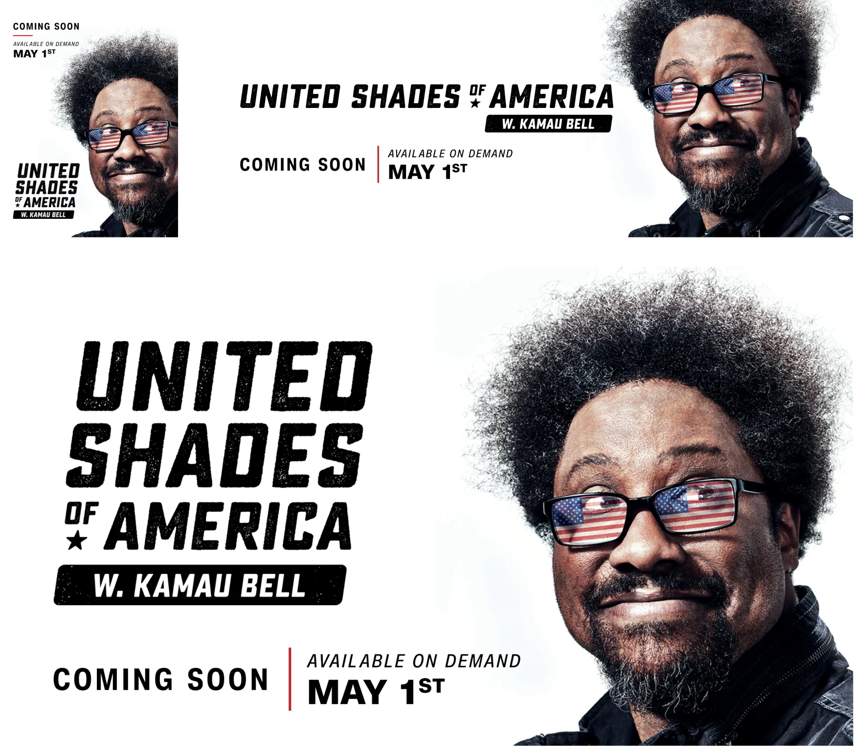
The tile assets and backgrounds were designed across three breakpoints: 16:9, 16:5, and 3:4. Each format balanced the imagery with the information viewers needed, building consistency across the library without flattening the character of the shows.
16:9
Landscape
16:5
Wide
3:4
Portrait
Tile assets and backgrounds in three breakpoints.
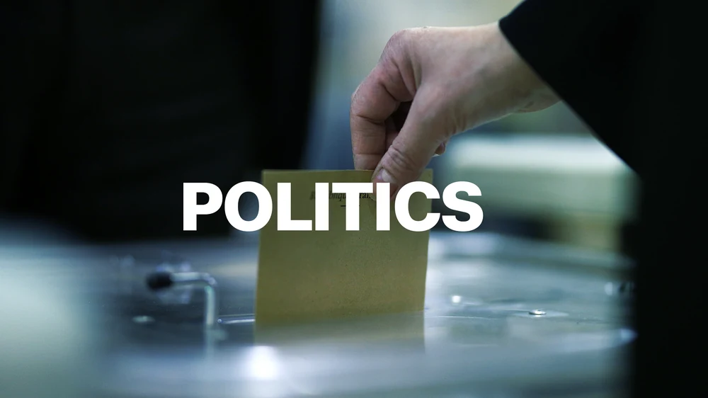
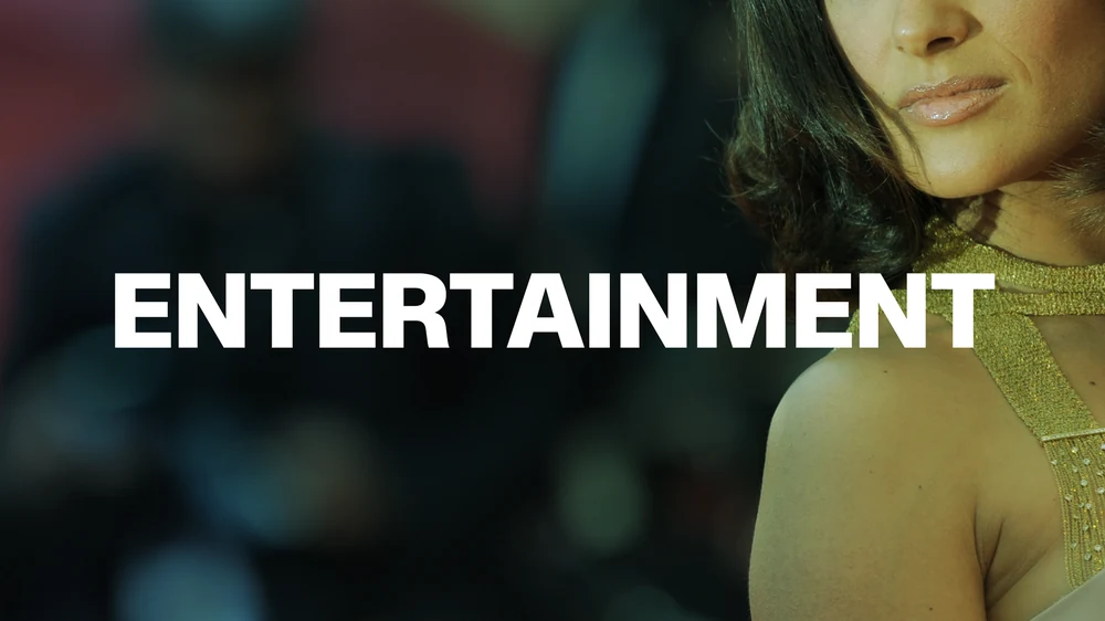
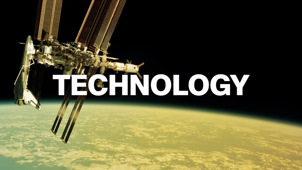
Category tiles
Explore by interest.
Promotional explorations
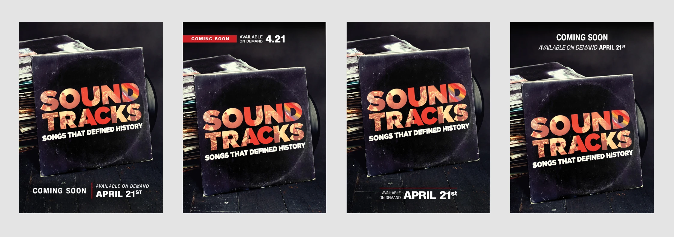
Coming Soon & Watch Live.
Watch Live promotions and their placement within CNNgo.
Selected artwork
Distinct shows. Consistent formats.
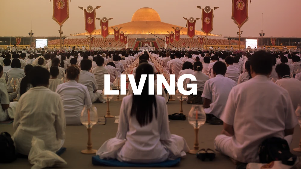
Promotional artwork for four CNN Original Series, adapted across portrait, wide banner, and landscape layouts.
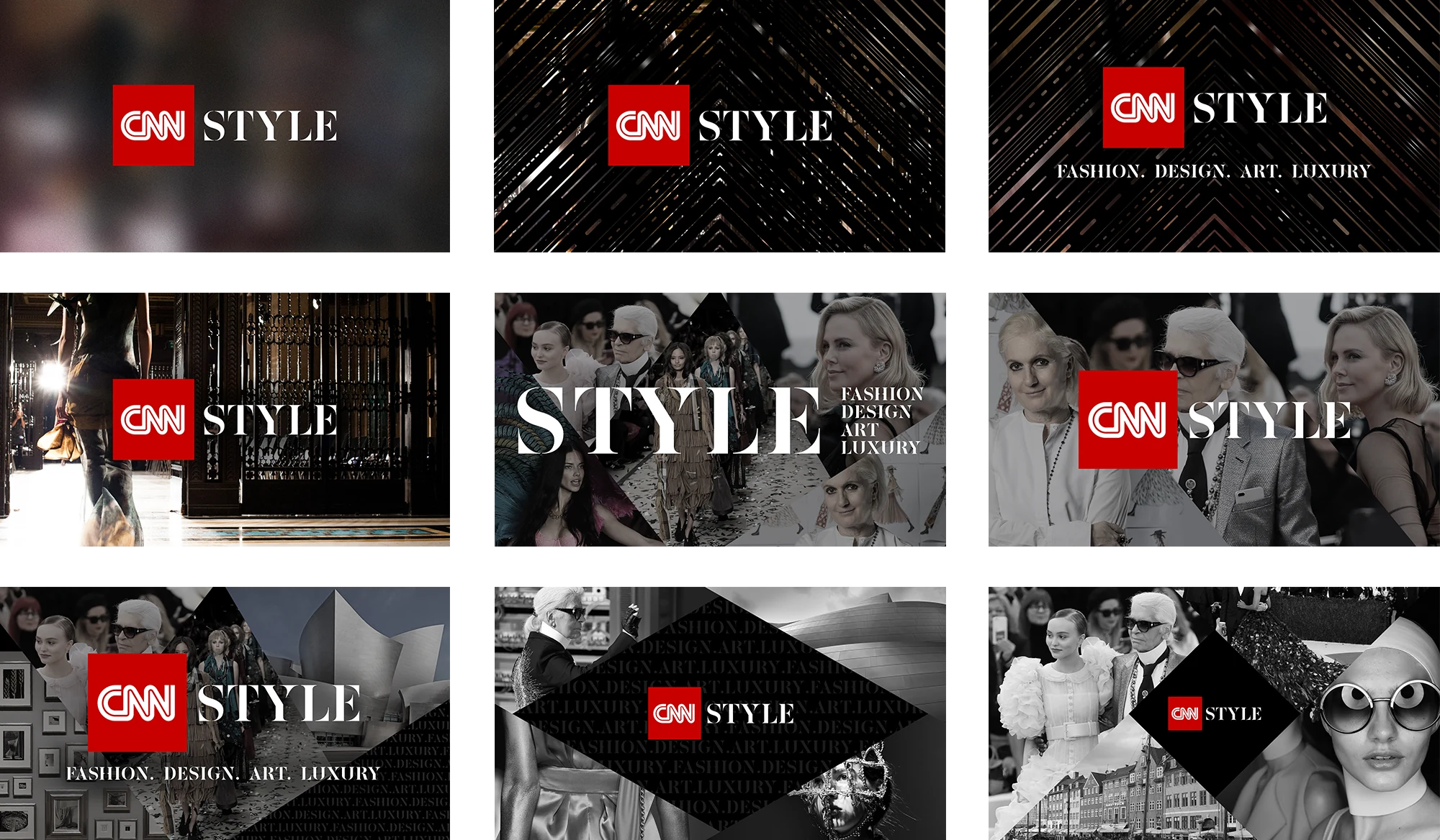
CNN Style
Fashion. Design. Art. Luxury.
The impact
A more cohesive viewing experience.
Content library
Updated ~75% of CNNgo’s content library, including hundreds of assets
Across screens
Optimized artwork across 3 breakpoints and aspect ratios
Viewing experience
Improved title and episode legibility and consistency